 Admin
Admin
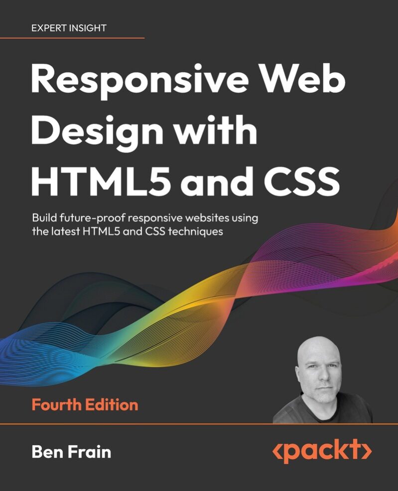
Responsive Web Design with HTML5 and CSS by Ben Frain: Build Future-Proof Responsive Websites
Introduction
In this world of technology, devices, browsers, and user expectations evolving at breakneck speed, you can’t afford to build static or fragile layouts. Responsive Web Design with HTML5 and CSS by Ben Frain (4th Edition) gives you the tools and techniques to stay current. If you want your websites to adapt to new screen sizes, accessibility standards, and performance expectations — this book is one of the best guides out there.
Target audience: Web developers, front-end engineers, UI/UX designers, and anyone with basic HTML & CSS who wants to master modern responsive design.
Key Take-Aways from the Book
- Understanding and applying modern layout techniques (Grid, Flexbox, Subgrid, container queries) to build fluid, responsive UIs.
- Best practices for HTML5 semantics, accessibility (WCAG, ARIA), and responsive images/media.
- Use of advanced CSS features: custom properties, clamp/min/max functions, color-manipulation tools, cascade layers, nesting.
- How to convert old/pixel-based designs into fluid, future-friendly layouts.
- Real-world workflow tips: testing across devices, optimizing performance, browser support trade-offs.
About the Book
Ben Frain’s Responsive Web Design with HTML5 and CSS is the fourth edition (2022) of a bestselling guide focused on bringing responsive web design practices up to date with the newest HTML5 and CSS capabilities. Source: Packt.
What makes this edition particularly relevant:
- Includes bleeding-edge CSS features: container queries, CSS cascade layers, nesting, subgrid — features that are either recent or in emerging support status.
- Emphasis on accessibility, semantics, and user preferences (e.g., color preference, reduced motion) to ensure designs are inclusive.
- Updated content for responsive images, SVG handling, new HTML5 elements, as well as performance considerations.
The structure of the book is logical: it begins with foundational principles, moves into core front-end skills, and then covers the latest platform features plus advice for future workflows. Each chapter includes examples, exercises, and downloadable code. This makes it both a text to read end-to-end and a reference to dip into when faced with particular responsive design challenges.


Book Details
| Field | Details |
|---|---|
| Title | Responsive Web Design with HTML5 and CSS: Build future-proof responsive websites using the latest HTML5 and CSS techniques |
| Author(s) | Ben Frain |
| Publisher | Packt Publishing Ltd |
| Year | 2022 |
| Edition | Fourth Edition |
| Pages | 504 |
| ISBN-13 | 9781803242712 |
| ISBN-10 | 9781803242713 |
| Formats | Paperback; eBook (PDF / EPUB / Kindle etc.) — exact file size not fully specified |
| Language | English |
About the Author
Ben Frain has been a web designer/developer since 1996, currently serving as UI/UX Technical Lead at bet365. He holds a degree in Media and Performance from Salford University. Through writing, code samples, and practical examples, he brings real-world front-end challenges into the book.
He has authored earlier editions of this same title, among other works, and is respected for clear explanations in modern front-end web design disciplines.
Table of Contents
- Section I: The Fundamentals of Responsive Web Design
What this section teaches: core principles of responsive design, understanding the modern device landscape, writing accessible HTML, and implementing first responsive projects.- Chapter 1: The Essentials of Responsive Web Design — defines responsive design, explores viewport configuration, and walks through building your first adaptive webpage step by step.
- Chapter 2: Writing HTML Markup — covers semantic HTML5 elements, accessibility best practices, embedding media, using the
<dialog>element, and avoiding obsolete features. - Chapter 3: Media Queries & Container Queries — explains syntax, advanced responsive breakpoints, color-scheme queries, and introduces container queries for component-level responsiveness.
- Chapter 4: Fluid Layout & Flexbox — shows how to convert fixed pixel layouts into fluid designs, align and order items, and manage wrapping with Flexbox.
- Chapter 5: Layout with CSS Grid — teaches grid setup, shorthand syntax, placing and sizing items, nesting elements, and practical design applications using CSS Grid.
- Section II: Core Skills for Effective Front-End Web Development
What it adds: modern CSS tools, advanced selectors, flexible typography, accessible color usage, responsive images, scalable SVG, and smooth animations.- Chapter 6: CSS Selectors, Typography, and More — advanced selectors, pseudo-classes, responsive units, feature queries, and using variable fonts for adaptive text.
- Chapter 7: CSS Color — explores RGB, HSL, wide-gamut color,
color-mix(),color-contrast(), fallbacks, and accessible color combinations. - Chapter 8: Stunning Aesthetics with CSS — text/box shadows, gradients, filters, blend modes, and performance-conscious styling techniques.
- Chapter 9: Responsive Images — modern formats (WebP/AVIF),
srcsetandpicture, resolution switching, and optimizing images for performance. - Chapter 10: SVG — history, creating and optimizing SVGs, inline vs. external usage, symbols, and advanced vector capabilities for scalable graphics.
- Chapter 11: Transitions, Transformations & Animations — applying CSS transitions, 2D/3D transforms, and keyframe animations with real-world interactive design exercises.
- Chapter 12: Custom Properties & CSS Functions — using CSS variables,
clamp(),min(),max(), and combining functions for responsive scaling. - Chapter 13: Forms — building semantic HTML5 forms, input types, validation, and enhancing usability with CSS styling.
- Section III: Latest Platform Features and Parting Advice
What you’ll get: cutting-edge CSS features, workflow tips, bonus design techniques, and strategies for maintaining scalable, future-proof responsive websites.- Chapter 14: Cutting-Edge CSS Features — cascade layers, CSS nesting, container queries (advanced), and future-facing techniques making their way into browsers.
- Chapter 15: Bonus Techniques & Parting Advice — tips like truncating text, horizontal scroll panels, and the author’s closing recommendations for professional front-end practice.
Key Highlights & Practical Applications
| Highlight | Application / Exercise |
|---|---|
| Container Queries & Component-Scoped Styles | Pick a component (card/sidebar); create container query that changes layout depending on container width. Deploy in component library or sample site. |
| Custom Properties + CSS Functions (clamp, min, max) | Build fluid headlines/paragraphs: heading sizes scale between mobile & desktop using clamp(). Use custom properties for min, max, preferred values. Test in browser. |
| CSS Cascade Layers & Nesting | Refactor existing stylesheet: introduce layers (base, layout, components, utilities), use nesting to simplify component styles & reduce selector complexity. |
| Modern Color Tools & Accessibility | Create theme palettes adapting to light/dark, validate contrast (WCAG), use prefers-color-scheme and color functions. |
| Responsive Images & SVG Practices | Build gallery component with <picture>, srcset for multiple resolutions, inline SVG icons, test performance (file size, rendering). |
Expert Review
Strengths
- Up-to-date coverage of modern responsive design tools, container, queries, cascade layers, grids.
- Strong emphasis on semantics and accessibility, often overlooked elsewhere.
- Mix of theory & practice: code examples, exercises, real-world relevance.
- Covers performance and trade-offs, not just what’s possible but what’s sensible.
- Clear writing style, good structure; useful for both reading through or referencing selectively.
Weaknesses / Limitations
- Newer CSS features may have inconsistent browser support; fallbacks needed.
- Some chapters are denser; may be overwhelming for total beginners.
- Examples / lab assets size or download availability vary by region.
- Doesn’t dive deeply into dynamic layout via JavaScript or interactive responsive behavior beyond CSS/HTML.
- Projects requiring legacy browser support will need additional work.
Star Ratings
| Aspect | Rating | Comment |
|---|---|---|
| Content Depth | 5/5 | Extensive, covering foundational to bleeding-edge features. |
| Practicality | 4.5/5 | Many exercises; highly usable in workflow, though some features need caution re support. |
| Readability | 4.5/5 | Well-written; some parts dense but overall accessible. |
| Value-for-money | 4.5/5 | Comprehensive for the price; especially valuable to serious front-end practitioners. |
Who Will Struggle With This Book and Why
- Complete novices – some advanced CSS assumes you already know basic layout and selectors.
- Heavy JS/interactive layout developers expecting dynamic/responsive JS parts are not fully covered.
- Teams/projects requiring support for very old or obscure browsers; many modern features have limited support.
- Those who prefer visual design tools over hand-coding may find dense CSS sections less engaging.
Who Should Read This Book?
| Persona | Why It Benefits Them | Recommended Sections to Focus On |
|---|---|---|
| Front-End Developer (experienced) | Update skills, get into new CSS layout & responsive feature set | Layout with CSS Grid; Custom Properties & CSS Functions; Cutting-Edge Features |
| Back-End Developer wanting Front-End skills | Learn clean HTML/CSS, design responsive sites without relying on JS frameworks | Writing HTML Markup; Media Queries; Typography & More |
| UI/UX Designer | Understand what is feasible, trade-offs, accessibility & image handling | Color; Responsive Images; Aesthetic enhancements |
| Teacher / Educator | Modern syllabus; exercises; structure good for structure in teaching | Whole book; select modules aligned with course syllabus |
| Freelancer / Agency Developer | Maintainability, performance, workflow improvements | Parting Advice; Performance; Modern features |
| Hobbyist / Self-Learner | Grow skills steadily; reference material | Start Section I; then pick topics of interest |
| Accessibility Advocate | Deep content on semantics, ARIA, user preferences, color contrast | HTML semantics; Color chapters; Media queries for preferences |
Related Resources / Books
- Practical Threat Detection Engineering by Megan Roddie, Jason Deyalsingh, Gary J. Katz
- Linux for System Administrators by Viorel Rudareanu & Daniil Baturin
Frequently Asked Questions
Q: Is Responsive Web Design with HTML5 and CSS suitable for beginners?
A: Yes, the book assumes a working knowledge of HTML & CSS but not advanced topics. Beginners will get plenty, especially in early chapters, but may need to go slower in advanced CSS features.
Q: Do I need to know JavaScript first?
A: No. The book focuses on HTML and CSS. JavaScript is not required. But for dynamic behavior beyond layout or style, you’ll need JS separately.
Q: What is the main keyword I should remember?
A: Responsive Web Design with HTML5 and CSS, that phrase captures the main theme and techniques of the book.
Q: Are the newer CSS features covered production-ready?
A: Many are. But browser support for container queries, subgrid, and cascade layers is still evolving. It’s important to check compatibility and provide fallbacks or progressive enhancement.
Q: Is the book updated over previous editions? What’s new in the 4th edition?
A: Yes; it adds more recent CSS tools (container queries, nesting, cascade layers), updated image and SVG coverage, more accessible practices, and better performance advice.
Q: Are code examples & labs available?
A: Yes, each chapter comes with downloadable examples. You can work through them and test in your local environment.
Q: Will this book help if I build sites using frameworks (React, Vue, etc.)?
A: Absolutely. Even in component-based frameworks, you still need to understand CSS, layout, responsive techniques, and performance. The examples are universal — you can apply what you learn inside any front-end stack.
Q: How long will it take to read & apply the book?
A: If you read and do exercises consistently, you could go through the book in ~6-8 weeks (for moderate pace), longer if you deeply test each technique or integrate in production.
Q: Is the book good for designing for accessibility and inclusivity?
A: Yes; topics like ARIA, semantic HTML, color contrast, user-preference media queries are well covered. The author takes inclusive design seriously.
Q: What tools or environment do I need to follow along?
A: A code editor, modern browsers (Chrome, Firefox, Safari, Edge) with dev-tools, ability to test responsive viewports, optionally design tools for assets (SVG, images). No special setup is required.
Download
Download — Building Your Own JavaScript Framework (PDF)
Format: PDF (eBook)
File size: varies by edition
Short disclaimer:
This download is presented for educational purposes only. Always support the author and publisher by purchasing the official edition if you find the material useful. Unauthorized distribution or piracy harms authors and the community.
Download the Code / Lab Assets
The book provides code examples and lab assets to accompany its hands-on parts. They can be found via the publisher’s site or the GitHub repo. [Visit Github Repo]
Actionable Study Plan / Curriculum (8 Weeks)
| Week | Learning Goals | Tasks / Labs | Deliverable |
|---|---|---|---|
| Week 1 | Foundations: understand responsive design, HTML semantics, accessibility basics | Read Section I Chapters: Essentials & Writing HTML Markup. Do exercises on semantic HTML, create sample page with proper HTML5 structure. | Simple multi-device HTML page with semantic structure and embedded media. |
| Week 2 | Media queries, container queries, fluid layouts | Read Chapters: Media Queries & Container Queries, Fluid Layout & Flexbox. Lab: convert fixed-width design into fluid layout; experiment with container query in one component. | Responsive card component that reflows with container query + flexible layout for primary page. |
| Week 3 | Grid & subgrid, layout control | Read Layout with CSS Grid. Build layout wireframes using grid for main site structure (header, nav, content, sidebar, footer). | Responsive site layout sketch & implementation using CSS Grid. |
| Week 4 | Typography, selectors, units, responsive color | Read CSS Selectors, Typography & More; CSS Color. Practice fluid typography, variable fonts, color contrast validation. | Style guide component: headings, paragraphs, theme colors with dark/light modes. |
| Week 5 | Aesthetics: Images, SVG, visual enhancements | Read Responsive Images & SVG; Stunning Aesthetics with CSS. Lab: build image gallery, inline SVG icons, filters/shadows/gradients. | Gallery + decorative visuals page (with SVG and aesthetic effects). |
| Week 6 | Transitions, animations, custom properties, functions | Read Transitions, Transformations & Animations; Custom Properties & CSS Functions. Create interactive elements, animate components, use clamp/min/max. | Animated card or menu; fluid spacing and typography; custom property theme. |
| Week 7 | Cutting-Edge Features & Final Polishing | Read Cutting-Edge CSS Features; Bonus Techniques & Parting Advice. Refactor code: layering, nesting, performance improvements. | Polished site with modern features; performance report; browser compatibility tested. |
| Week 8 | Project & Review | Use all you’ve learned to build a small responsive website (e.g., portfolio, blog, product page). Peer review or get feedback; reflect on weaknesses. | Full responsive website deployed; summary report: what went well, where trade-offs were made. |
Conclusion
If you’re serious about building websites that are resilient, accessible, and maintainable in a rapidly changing front-end landscape, Responsive Web Design with HTML5 and CSS (4th ed.) by Ben Frain is a top pick. It strikes an excellent balance between up-to-date techniques and practical advice. Whether you’re already doing responsive design or just starting, there’s something in it to stretch your skills.
Next steps: pick up the book, follow the 8-week plan above, and apply one highlight or lab from each week in a side project. Share your progress, experiment, and revisit chapters that challenge you.
Was this article helpful?
Loved it? Share your thoughts with a quick comment, submit recommendations and suggestions or leave a star rating in comments!
Free Download
